This is a new form of multidimensional Risk Assessment. It uses some prior art in an accepted view that a Risk is a combination of both a hazard severity rating and a likelihood of that hazard being realised. These are combined as follows on the Hazard Table below where the vertical axis gives hazard severity and the horizontal axis gives likelihood.
| Hazard | improbable | possible | probable | likely | certain |
| minimal | 4% | 14% | 28% | 47% | 72% |
| minor | 9% | 23% | 41% | 66% | 90% |
| major | 19% | 38% | 61% | 85% | 104% |
| severe | 33% | 57% | 81% | 100% | 114% |
| catastrophic | 52% | 76% | 95% | 110% | 120% |
The second theme is Exposure; that is how much damage is likely to be inflicted on a group given the training and estimate of financial exposure to the Hazard. This can exist in isolation to the pure Hazard Risk; that is the hazard of being sunburned remains a realistic probable hazard on a daily rate in summer, but if we provide more shelter across the population, we reduce exposure. We do not adjust the Hazard rating as the hazard is unchanged and the sun is still burning. We account for these mitigations in the exposure index. These are combined as follows on the Exposure Table below where the vertical axis gives financial exposure and the horizontal axis gives an indication of planning, training and education.
| Exposure | PhD | Post Grad | Under Grad | Certificate | Basic ed |
| $ 102 | 4% | 14% | 28% | 47% | 72% |
| $ 104 | 9% | 23% | 41% | 66% | 90% |
| $ 106 | 19% | 38% | 61% | 85% | 104% |
| $ 108 | 33% | 57% | 81% | 100% | 114% |
| $ 1010 | 52% | 76% | 95% | 110% | 120% |
The third theme Vulnerability; that is how much further damage is likely to be inflicted on a group given Realisation of the hazard, this is particularly useful in disaster relief scenarios. The Hazard now has largely gone and traditional Hazard Risk assessments would stop here. The Wolaig chart allows us to pre-assess some of the factors that will impact the group after the primary Risk. This MAY involve a series of scenarios being developed, but it finally accounts for the post hazard time. These are combined as follows on the Vulnerability Table below where the vertical axis gives proportion of the population size impacted and the horizontal axis gives knowledge and experience of the situation.
| Vulnerability | Within last week | Within Last Month | Within Last Year | Within Last 10 years | Within Last 50 years |
| < 20% | 4% | 14% | 28% | 47% | 72% |
| < 40% | 9% | 23% | 41% | 66% | 90% |
| < 60% | 19% | 38% | 61% | 85% | 104% |
| < 80% | 33% | 57% | 81% | 100% | 114% |
| < 100% | 52% | 76% | 95% | 110% | 120% |
Mapping to the Wolaig Chart
The next part of the Wolaig Chart is to map the various percentages on the Triangle. The percentage is mapped as a circle from the relevant apex of the triangle. The chart is to scale and outlines that a Risk below 96% is manageable within current workplace paradigms. However, once a Risk is above this (and therefore crosses the other axis) it is not possible to state that the workplace is resourced to continue to manage this Risk and must introduce additional appropriate resources to account for this.
The 96% percent mark is referred to as the Risk to Risk line, that is that one Risk has now skewed the ability to assess the other Risk tables. This line represents the circle drawn from one point now crossing over to the opposite axis. It gets it’s name from the fact that this risk class has now crossed onto another domain suggesting that this risk class is now clouding the ability to judge and manage other classes.
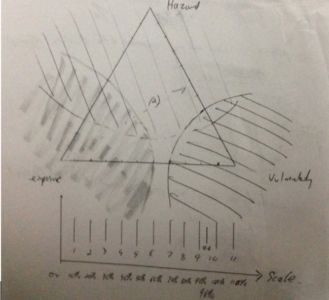
The amount of overlap in the middle is also refereed to as the mud. If there is very little mud, then it is most likely well within the team to manage the Risk in isolation, but as the overlap increase and the mud deepens, there is an implicit need to increase resources to meet the Risk.
Risk Appétit in the Wolaig Chart.
The Wolaig chart allows for the graphical representation of the combined risk of the particular phase. It is worked out as the average of the overlap of each circle to each other. The score ranges from minus 110 % to plus 110% and can be worked out on the template as:
Average % [[ (E+V-110) , (V+H-110) , (H+E-110) ]]
This then makes for easy reporting of the risk with reference to the key stakeholders appetite for risk. That is a very risk adverse manager will set a threshold closer to minus 60 or 70 %. The more risk tolerant manager will set at perhaps positive 60 or 70 %.
An added feature of the Wolaig chart is the ability to plot 7 linked tri-graphs that detail the changes to the indexes across time. This shows the change in the risk assessment (along HEV classes) as time progresses. The 7 phases are labelled
Alpha Pre Event Time (extended time)
Beta Pre Event Time (minus minutes)
Chi Hazard Event time
Delta Hazard Event time (plus minutes)
Gamma Hazard Event time (plus hours)
Epsilon Hazard Event time (plus days)
Foxtrot Hazard Event time (plus months)
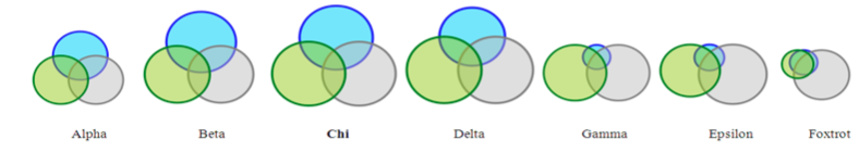
– Time – Minutes Event + Minutes + Hours + Days + Months
Hazard Appears Hazard reduces .
Exposure Low Exposure Peaks Exposure Low .
Vulnerability Low Vulnerability Peak .
I thank you sincerely for the opportunity to put forward my view on Risk and hope you enjoyed the story. I can be contacted easily for interview or to provide further information to support my idea.
End January 2017